 One of the few rewards of watching Reading away as a student in the early 1990s was the opportunity it afforded of seeing once proud industrial Britain before it was bulldozed. The prospect of visiting grounds condemned by the Taylor Report was often a stronger motive to leave Berkshire than watching Reading fail to escape the clutches of mid-table mediocrity. Particular highlights included an unlikely victory at Stoke’s Victoria Ground in November 1990 and the views of Huddersfield from the away end toilets at Leeds Road.
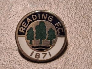
Curiously, it was only in England’s manufacturing towns that I saw old men sell enamel club badges from trays outside football grounds. And it would be in Cottonopolis that I became acquainted with this particular pin badge, on 10 September 1994. For most Reading fans, I suspect that Simon Osborn’s marvellous lob is their main memory of that 3-1 victory at Oldham’s Boundary Park; it was indeed the moment that I started to believe that the 1994-95 season was going to be something quite special. But my main highlight was finding this fine symbol of the club.
As a child in the 1980s, I witnessed Roger Smee’s attempt to ‘modernise’ Reading by changing the elm trees badge to something that was (allegedly) designed by Ian Branfoot’s daughter; certainly, it was remarkable it that it said nothing about the club or town. This badge, on the other hand, says it all: the elm trees, the two rivers, the blue-and-white and the founding date. I left Reading many years ago and currently reside north of the border in a country where Terry Hurlock is still regarded as an accomplished player. However, this badge takes me back instantly to the Reading of Martin Hicks, Trevor Senior, Courage and the After Dark.
This piece of memorabilia is from Julius Ruiz

